Tone-on-Tone: Why Black-on-Black Print Reads Richer Than Color
Flat light absorbs it. Direct sunlight reveals it. How matte damask sublimation creates motion through light rather than pigment.
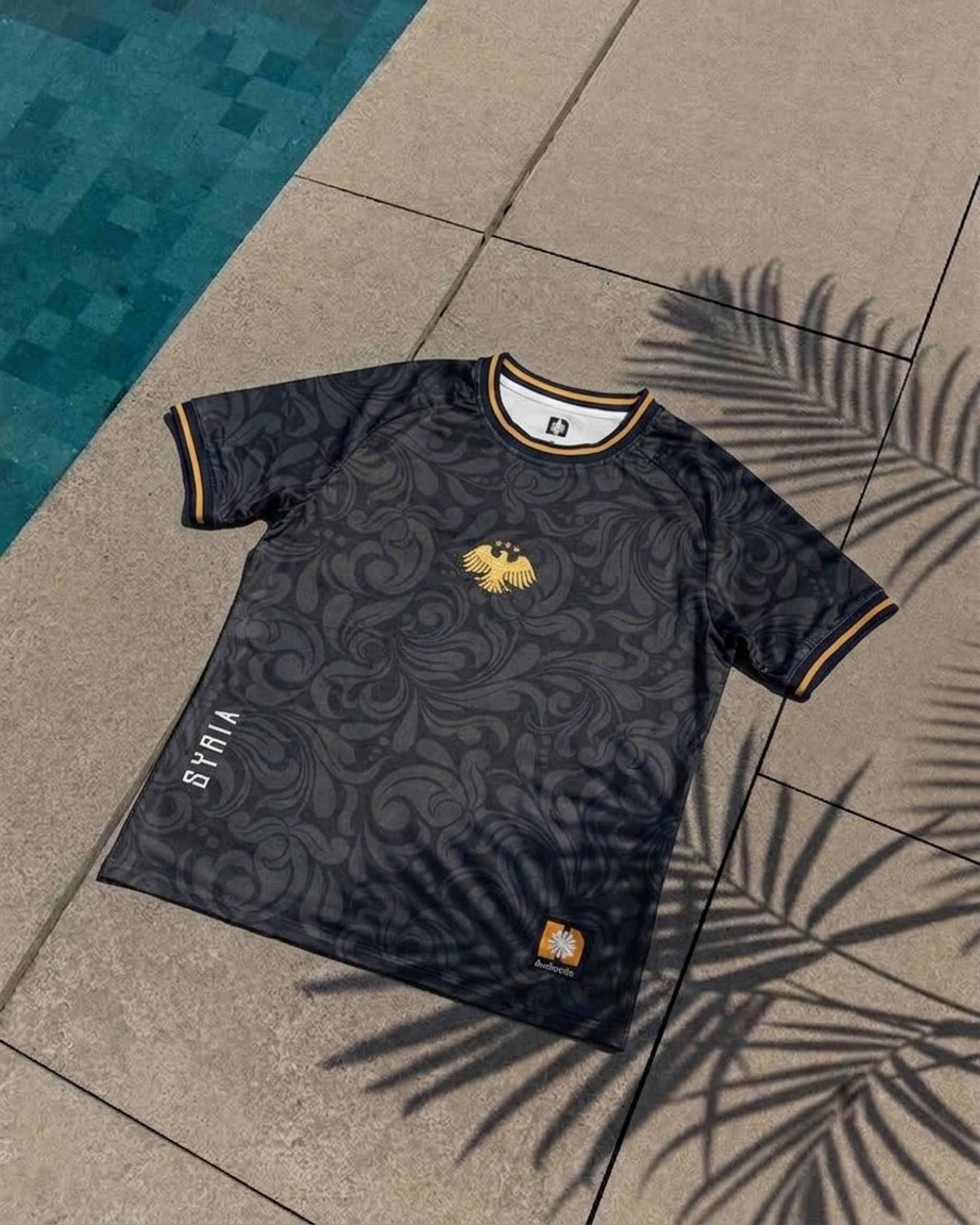
The Optical Illusion of Monochromatic Contrast
High-contrast color graphics demand attention instantly by dominating the visual field. But they also exhaust the eye quickly. Tone-on-tone printing operates on an entirely different perceptual axis: discovery through illumination.
By employing deep carbon pigment against an obsidian base, the Ornament pattern remains dormant under soft indoor ambient light. From across a room, the garment reads as a pristine blackout silhouette.
However, as soon as directional photons hit the weave — whether morning sunlight breaking through trees or streetlights reflecting off wet asphalt — the micro-variations in ink density reflect light at distinct angles. The baroque ornamentation suddenly emerges with three-dimensional depth.
"Color is static. Tone-on-tone is kinetic — changing its character every time you step into a new room or light source."
Eliminating the Plastic Sheen of Cheap Polyesters
The single greatest flaw of standard sportswear sublimation is the glossy synthetic luster that occurs when heat-pressing low-grade fibers. It makes dark garments look grey or greasy under bright lamps.
We engineered a specialized matte-surfactant carrier ink paired with a dense 180 GSM circular knit. The result is total photon absorption on the base panels, allowing only the satin stitch embroidery and subtle damask relief to catch specular highlights.

Ornament Jersey — Obsidian
180 GSM matte damask circular knit with 3-color raised gold bullion crest.